DIALOGUE: Carla Palette | Brand Designer & Art Director
- Onur Çoban

- Aug 9, 2023
- 7 min read

We had a conversation with Carla Palette, a brand identity designer who creates impactful and provocative brand experiences by pushing people to make bold and unconventional statements that embrace current social tensions. Through her work and production practices, she establishes meaningful connections between progressive brands and socially conscious audiences with high expectations.
Who is Carla Palette? Can you briefly tell us about yourself?

People-pleasing is boring, passive and inauthentic. I’m a brand designer & art director who creates influential and provocative brand experiences by challenging people to make bold and unconventional statements that acknowledge current social tension, cultivating meaningful connections between progressive brands and socially conscious audiences with high expectations.
Working independently with my own clients or in collaboration with a larger agency, I work predominantly with beverage, fashion, food and lifestyle brands from all around the globe. With an extensive creative network, I like to form specialist teams that cater to the individual needs of my clients, resulting in strong collaborations and more impactful results. From conception to the outcome, I use finely-tuned processes in conceptual design and strategic thinking to execute on aesthetically striking visual identity systems, boutique packaging and thought-provoking advertising.
How do you think creating bold and unconventional experiences can add value to brands? What impact do such experiences have on brands' relationship with society?
I think creating bold and unconventional experiences is almost a necessity in the current oversaturated branding landscape we are in. With Gen Z audience becoming more and more opinionated and the onslaught of social politics that is left in their stride setting the tone for how society has shifted and thus, how brands need to behave, It’s more important then ever for brands to have strong opinions and a bold / unconventional approach to cut through the noise, as well as resonate with a growingly opinionated and socially / politically charged society. So I think brands can add a lot of value to their own reputation and overall brand experience by catering to this societal change, through being unapologetic, bold and unconventional in their approach.


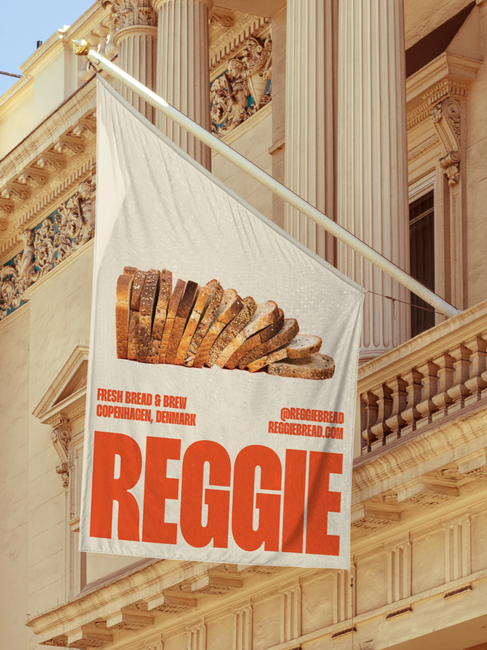
REGGIE
Unfortunately, we live in a society where you can get canceled for something you said 7 years ago, let alone something you said 7 hours ago. In order for brands to align with the current social/political stand point, they need to have strong opinions that people can recognize themselves in the brand and align themselves with - so bold and unconventional brand experiences that are highly tailored to a specific audience, allows brands to foster more intimate relationships and brand experiences for their audience. As an effect of this, brands have to be more careful than ever about the message they are sending, as society's tolerance for bullshit and manipulative brand messaging has significantly lowered.
How does working with brands worldwide offer an experience of different cultures' aesthetics and marketing expectations? How do you turn these differences into an advantage?
Working with brands from around the world does allow you to zoom out and appreciate the different approaches needed for each different brand to resonate with different audiences from different cultures. After experiences with working with many brands from many different & conflicting cultures it does create an advantage, as a lot of designers don’t understand the dramatic differences in mindset, aesthetics and needs from one culture to the other - and once you have an understanding for this, you are able to use this understanding to your advantage when resonating with different cultural audiences.
As a brand identity designer, what are your thoughts on the psychological effects of colors on people? How does color choice affect the brand experience?
We are traditionally taught that certain colours visually transmit a certain message or should make us feel a certain way, which can, at times, be true but it often leads into outdated concepts that don’t hold much merit in the real world. For example, blue, is traditionally known to communicate open and clear communication, safety, and trust - which you can see exemplified through industries that rely on these themes to survive - be it your financial or pharmaceutical industries as examples. But then, on the other hand, blue is also used on lots of cigarette packaging, who are famously not known for wanting to communicate or inspire safety, trust or open and clear communication. Another example is red, which is traditionally used to communicate danger or to trigger a sense of alarm within the viewer, however, that doesn’t mean people will stop drinking from red Coca-Cola cans or not fly on an airline that uses red within their core identity, which many do.

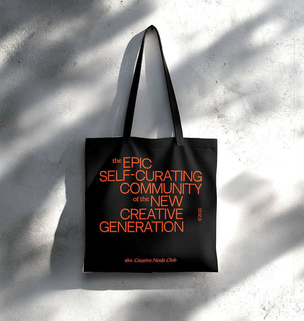
Print Collection Two
"I think the traditionally thought of 'psychological effects of colours on people' is load of bullshit. The topic is just so open for subjectivity and debate that making blanket statements per colour is just nonsensical."
In my eyes, we have no need to be bound to these traditional “psychological readings” per color because they’re purely restrictive. Restrictive for you as a designer but also for the way meaning is imposed onto your work disregarding every other element that works to inspire a certain emotion or message, instead of opening the door to more creative perspectives, it closes every door that doesn’t equate red with alarm bells and roadside warnings. Don’t get me wrong, colour affects visual experiences but it’s contextualised by all other elements around it in a brand and only given true meaning through these elements. It’s so refreshing to see brands break away from these self-imposed chains like, for example, Klarna - a bank - using pink at the core of their brand identity. They still manage to be successful with their messaging because of all other elements they use to communicate their brand to the end consumer without prioritising the “color psychology” of it all and settling for a boring and bland blue to get lost in the sea of blue financial brands - and instead choosing to attract new customers in unexpected ways and grabbing their attention to get their message across. We can’t count on brands always having the rappor to be branded the same way as they were 100 years ago because a brand should speak with a clear message and it should make people wanna listen. Being visually stimulating and daring is the best way to pique interest and make people want to tune in to what the brand wants to express.
Which of your works has excited you the most regarding the design process and the final product?
From the start, having the idea for BUNA - a boutique brand for whiskey lovers that challenges what is known for the whiskey category - was by far my favourite project to date. Every step was a trial and error to come up with the concept for a brand I would want to see in the market, a brand I felt was missing from the products accessible as a consumer at the time. Once I could localize my ideas to what I wanted and needed BUNAto be as a brand, I jumped into the creative process. In what way could I disrupt the traditional visual homogeneity of prestigious whiskey brands available right now, while still remaining tasteful and able to compete with the other said brands? This prospect in itself was exciting and enabled me to create outside the rigorously traditional box that existed in the market, going with a mixture of bold typography and charming illustrations contrasted with tougne-in-cheek brand messaging - is the last thing one would imagine when thinking of a prestigious whiskey brand and that’s what drove me to make it happen. The final product is everything I envisioned at the start: loud, bold, disruptive, cheeky but still fucking tasteful for a tough crowd to appreciate and respect.


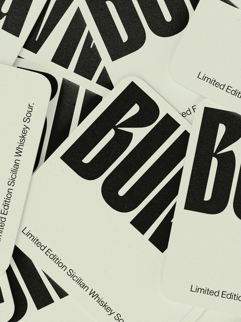
BUNA
Who are the names you follow with curiosity in this field or different disciplines?
Jessica Walsh. When I think about someone who constantly evolves and adapts to themselves in their new incarnation, personally and in their work, it’s always Jessica Walsh that I take as a name to follow. It’s so great to see a powerhouse creative be so unapologetic at leaving their own fingerprint on their work and making their style adapt to them and not to current trends. I’ts this honesty within her work that I admire and find inspiration in because I’ve also struggled with feeling the compulsive need to fit into the industry and comply with everything to be palatable and likeable. Breaking away from these restrictive notions is what’s helped me develop into the creative that I am today and having a figure that encourages this process, whose work I find just nice and appealing, is a good ideal to keep me on track on my own process of being no one but my own self, someone who isn’t afraid to swim against the current to keep true with their world view and the way they want this world to look like.
Are you excited for the future? What are your plans?
In a way, I am. I feel like with every year I get better at finding my niche and what areas I enjoy working in and that’s propelled my growth both as a designer and art director the most. When starting out, one doesn’t have the experience and ease to exclusively work with brands one gravitates towards and click with the best as there’s a lack of knowledge and experience that come into play but I’ve noticed that, more and more, I get to create brands I enjoy and brands that I personally would also consume in my everyday life.
In regards to my own development as a creative and my industry positioning also becoming more aligned with me as a person as it has been in the last couple of years, I am pretty excited to see where each coming spin around the sun takes me and what types of brands and projects I’ll find myself working with them. The only plan that I have for the future is to remain as uncomplacent with the status quo and to be as bold as ever. I’m looking forward to working on projects that allow me to disrupt the homogeny of the brand landscape and make controversial choices that will get the right people interested and talking.

Print Collection Two

WHINE

EVRYLASHES

Print Collection Two